Your landing page is the single most important factor in how well you convert visitors into leads or sales. Of course I do promote testing to make it the best it can be, however, there are some strategies that have been proven to be highly effective.
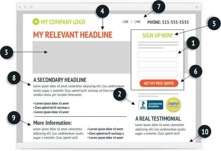
Eye tracking studies have shown that unless distracted, visitors will read left to right. This sample landing page has a strategic layout and color scheme – directing the visitor’s eyes from the headline and onto the point where we want them to take action – the form.
- THE FORM: For any landing page, forms should only include the absolute minimum you need to make contact. Less is better, start asking for more and you’ll see your conversion rate plummet.
- TRUST SYMBOLS: Credibility is Powerful. Put testimonials, credentials and trust symbols near your form or action button to increase conversion rates.
- HERO SHOT: The picture should support your headline or offer. Don’t select the picture for the sake of placing any graphic – people digest information quicker with a visual
- HEADLINE: Catchy headlines are great, but, don’t forget your visitor landed on this page as a result of a link somewhere else. What they really need is to know instantly that they are in the right place. Make your headline relevant to the offer and easy to digest.
- CALL TO ACTION: People respond (in greater numbers) to you telling them what you want them to do and when you want them to do it.
- BUTTONS: Studies have shown that conversion rates fall if you simply say “submit” on your button. Get creative or use the button as a continuation of the call to action.
- ADDITIONAL LINKS: resist the urge to lead your visitor off into “never to return land”. Only put links here that are essential.
- THE OFFER: Condense your offer as much as possible – think about what makes it unique and use bullet points. Here you can be creative with your secondary headline, but limit the amount of information.
- MORE INFORMATION: This is where you put whatever information your visitor may need to persuade them. Try and put yourself in the visitor’s shoes. What questions would they have? What roadblocks would possibly keep them from acting?
- BELOW THE FOLD: Continue the “more information” here. Answer as many possible questions as you think a visitor will have because most people won’t see this part of the page. This is the area where people will look when they are undecided so use it to give compelling reasons why they should consider your product or service.
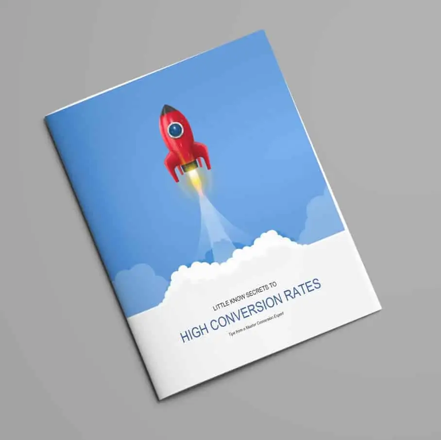
Want to learn more about landing page techniques and improving your conversion rates? Download our free whitepaper today.