
As of April 21, 2015 Google will be expanding its usage of mobile-friendly factors in its search algorithm. This change will affect mobile searches in all languages worldwide and will have a significant impact in the Google search results.
Anyone who does not have a responsive site capable of serving multiple devices will be affected… but, here are the things they are looking for in particular:
- A site that has software that is not common on mobile devices, like Flash
- A site that uses text that is not readable without zooming
- A site that doesn’t size content to the screen so users don’t have to scroll horizontally or zoom
- A site that doesn’t place links far enough apart so that the correct one can be easily tapped
Read more here: Google Webmaster Central
Test your site now: Google Mobile Friendly Test
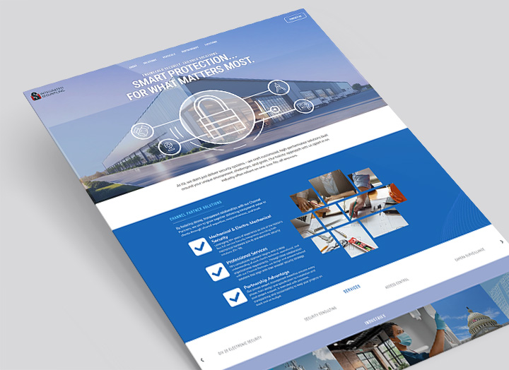
Responsive web design is an approach to web design allowing creation of sites with an optimal viewing experience across a wide range of different devices such as desktops, tablets and smart phones. Before responsive web design, you needed a different version of your website for each device.
Read more about our responsive web design services.